

Create a Human Face Illustration with HTML and CSS
Learn how to build a fully illustrated human face using only HTML and CSS. No images or SVGs needed—just creative styling.
2025-06-06
Create a Human Face Illustration with HTML and CSS
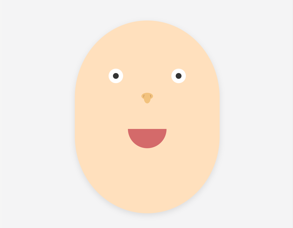
Ever wondered how far CSS alone can go? In this tutorial, we'll recreate a human face illustration using only HTML and CSS—no SVGs, no images. Just pure styling magic.
🎯 Step 1: Basic Layout
We center the canvas using Flexbox and define the background color.
body {
  margin: 0;
  background: #f4f4f5;
  display: flex;
  justify-content: center;
  align-items: center;
  height: 100vh;
}
🧱 Step 2: Head Shape
We use a div with an oval shape using `border-radius: 50% / 40%` to simulate a human face outline.
<div class="face-container">
  <div class="skin"></div>
</div>
.face-container {
position: relative;
width: 300px;
height: 400px;
}
.skin {
width: 100%;
height: 100%;
background: #ffe0bd;
border-radius: 50% / 40%;
box-shadow: 0 4px 12px rgba(0,0,0,0.1);
}👀 Step 3: Eyes
The eyes are two white circles with black pupils centered using pseudo-elements.
<div class="eye left"></div>
<div class="eye right"></div>
.eye {
width: 30px;
height: 30px;
background: #fff;
border-radius: 50%;
position: absolute;
top: 100px;
}
.eye::after {
content: '';
width: 12px;
height: 12px;
background: #333;
border-radius: 50%;
position: absolute;
top: 9px;
left: 9px;
}
.eye.left { left: 70px; }
.eye.right { right: 70px; }👃 Step 4: Nose
We use vertical and horizontal ovals to represent the bridge and base of the nose. Nostrils are added for realism.
<div class="nose">
  <div class="oval-vertical"></div>
  <div class="oval-horizontal"></div>
  <div class="nostrils">
    <div class="nostril"></div>
    <div class="nostril"></div>
  </div>
</div>
.nose {
position: absolute;
top: 150px;
left: 50%;
transform: translateX(-50%);
width: 30px;
height: 50px;
display: flex;
flex-direction: column;
align-items: center;
}
.oval-vertical {
width: 14px;
height: 22px;
background: #f1c27d;
border-radius: 50%;
position: absolute;
}
.oval-horizontal {
width: 24px;
height: 14px;
background: #f1c27d;
border-radius: 50%;
}
.nostrils {
display: flex;
justify-content: space-around;
width: 24px;
margin-top: -10px;
}
.nostril {
width: 4px;
height: 7px;
background: #cc9966;
border-radius: 50%;
}😄 Step 5: Mouth
The mouth is a simple semi-circle using `border-radius` only on the bottom corners.
<div class="mouth"></div>.mouth {
width: 80px;
height: 40px;
background: #d46a6a;
position: absolute;
top: 225px;
left: 50%;
transform: translateX(-50%);
border-bottom-left-radius: 40px;
border-bottom-right-radius: 40px;
border-top-left-radius: 0;
border-top-right-radius: 0;
}✅ Recap
- Used only divs with CSS for a full face
- No SVG, canvas, or image needed
- Teaches CSS positioning, flex, radius, and layering
You can now try animating parts, adding eyebrows, hair, or expressions—all with pure CSS.